.description-dro {
max width: 1000px;
}
.description-dro h3 {
font-size: 24px;
font weight: bold;
text align: center;
}
.description-dro p {
font-size: 19px;
text align: center;
}
.description-dro table {
border collapse: collapse;
margin top: 40px;
width: 100%;
}
.description-dro td {
padding: 8px;
height: 20px;
}
.description-dro tr:nth-child(even) {
background color: #f1f1f1;
}
.description-dro td:nth-child(1) {
width: 50%;
text align: right;
font weight: bold;
}
.description-dro td:nth-child(1) {
width: 50%;
text align: right;
font weight: bold;
}
.description-dro td:nth-child(2) {
width: 50%;
text align: left;
}
.description-dro img {
display: block;
align-items: center;
margin: 0 car;
width: car;
max width: 100%;
max height: 300px;
}
#description-dro-top-image {
border-radius: 25px 25px 0 0;
max height: max content;
}
#description-dro-banner-image {
max height: max content;
width: 95%;
margin-left: 2.5%;
border-radius: 20px;
}
#description-dro-title {
font-size: 27px;
}
#description-dro-text-left-image-right {
display: flex;
align-items: center;
flex: 1;
margin-left: car;
}
#description-dro-text-right-image-left {
display: flex;
align-items: center;
flex: 1;
margin-left: car;
}
#opis-dro-text-right-image-left img {
margin-left: 30px;
margin bottom: 30px;
margin top: 30px;
}
#opis-dro-text-left-image-right img {
margin-right: 30px;
margin bottom: 30px;
margin top: 30px;
}
#description-dro-textbox {
margin-left: 20px;
margin-right: 20px;
}
#description-dro-textbox h3 {
font-size: 24px;
}
#description-dro-round-image {
border-radius: 20px;
}
.description-dro-blackbox {
background color: #ffffff;
color: #030303;
border-radius: 40px;
}
.dro-blackbox p, .dro-blackbox h3 {
margin-left: 25px;
margin-right: 25px;
font-family: "PT Sans", sans serif !important;
font: "PT Sans", sans serif !important;
}
.description-dro-blackbox p {
padding-bottom: 20px;
color: #050505;
}
.description-dro-blackbox hr {
margin-left: 30px;
margin-right: 30px;
}
.description-dro-blackbox #whitepart, #whitepart h3 {
background color: #1c7236;
margin: 0;
color: #070707;
}
.description-dro-blackbox #whitepart {
padding top: 30px;
width: 95%;
margin-left: 2.5%;
border-radius: 20px;
}
#opi-dro-video-sidewrapper video {
height: 300px;
margin: 30px;
}
@media only screen and (max width: 959px) {
#description-dro-text-right-image-left {
display: inline;
}
#description-dro-text-left-image-right {
display: inline;
}
#opis-dro-text-right-image-left img {
margin: car;
margin top: 30px;
}
#opis-dro-text-left-image-right img {
margin: car;
margin bottom: 30px;
padding-bottom: 20px;
}
#opi-dro-video-sidewrapper video {
display: block;
margin: car;
}
}
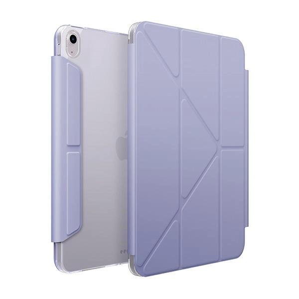
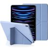
Reveal the beauty of your iPad with an ultra-slim, minimalist cover. Combining practicality with timeless style, it's the perfect everyday choice.
The perfect companion for your travels
Do you prefer to work in landscape orientation, or is portrait orientation more convenient for you? Camden Click offers the option to use it both vertically and horizontally. The Y-fold feature with three screen orientations lets you use iPad at the perfect angle, so you can easily get work done wherever you are.
iPad always ready to work
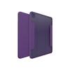
Camden Click is fully compatible with iPad's automatic wake-up and sleep function. With this case, your iPad automatically wakes up when opened and goes to sleep mode when closed, which increases the convenience of use and saves energy. In addition, the case easily folds back for quick access to the camera..
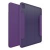
Built-in Apple Pencil holder
The stylus holder integrated into the case prevents loss of the stylus while providing easy access and simultaneous charging on the go.. Working with iPad has never been so enjoyable since you have everything in one place!
Technical data
Model
Camden Click
Type
Bookcase
Material
TPU/PC
Color
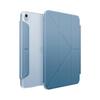
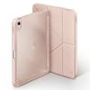
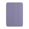
Purple
Compatibility
Apple iPad Air 13" (2024)